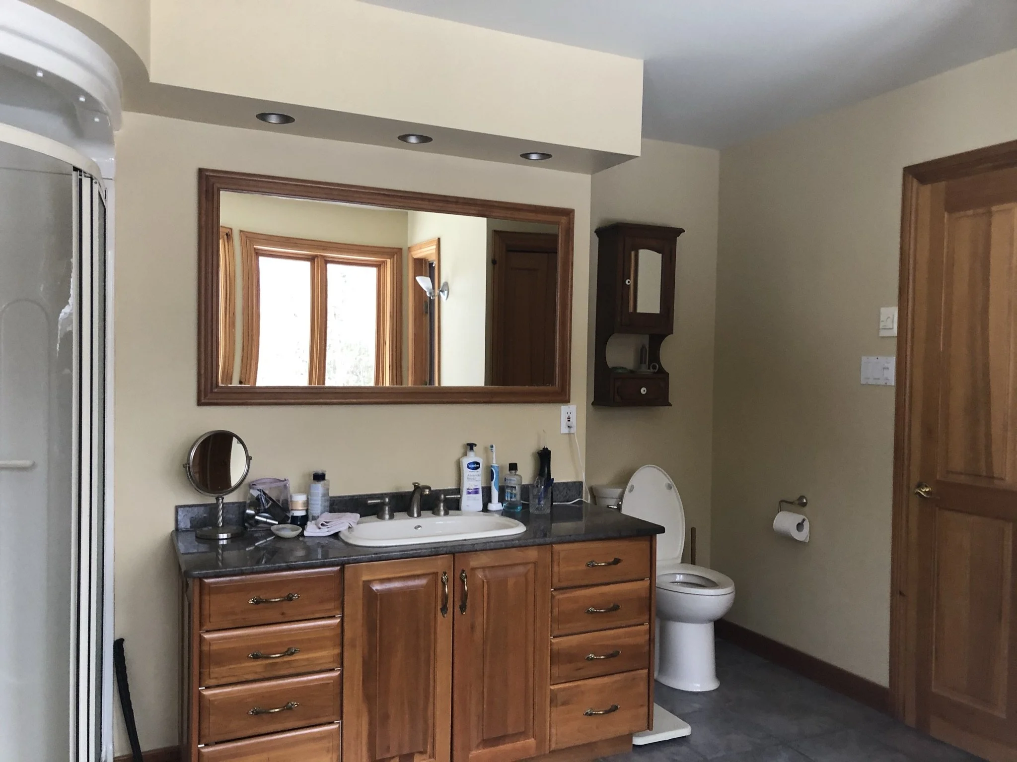
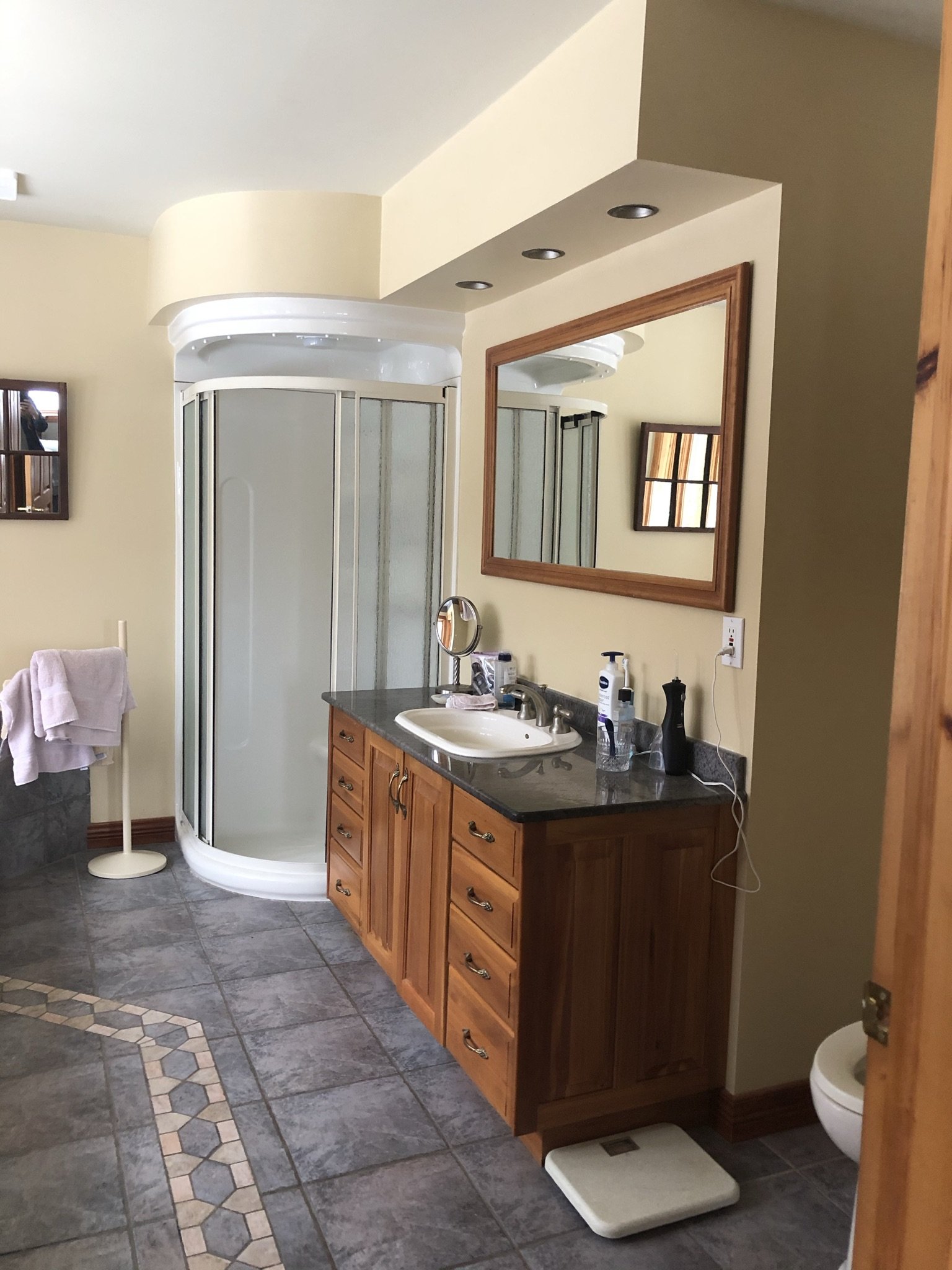
BEFORE & AFTER
A few changes to make life easier. It’s a fresh and timeless new look with a layout that’s functional and more practical.
Designing bathrooms and kitchen are quite similar. These spaces need to be super functional. Key elements to a bathroom design include a functional layout, good lighting and convenient storage space.
PROJECT GOALS
The room itself is spacious, however the clients needed to make changes. It was a must to have a shower that accommodates a walker/wheelchair for their possible future needs.
A safe and open space to access the shower and the bathroom in general were major points we focused on during the design phase.
DESIGN AND PLANNING
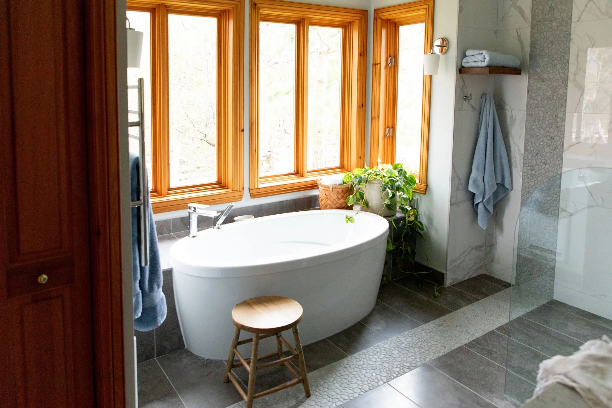
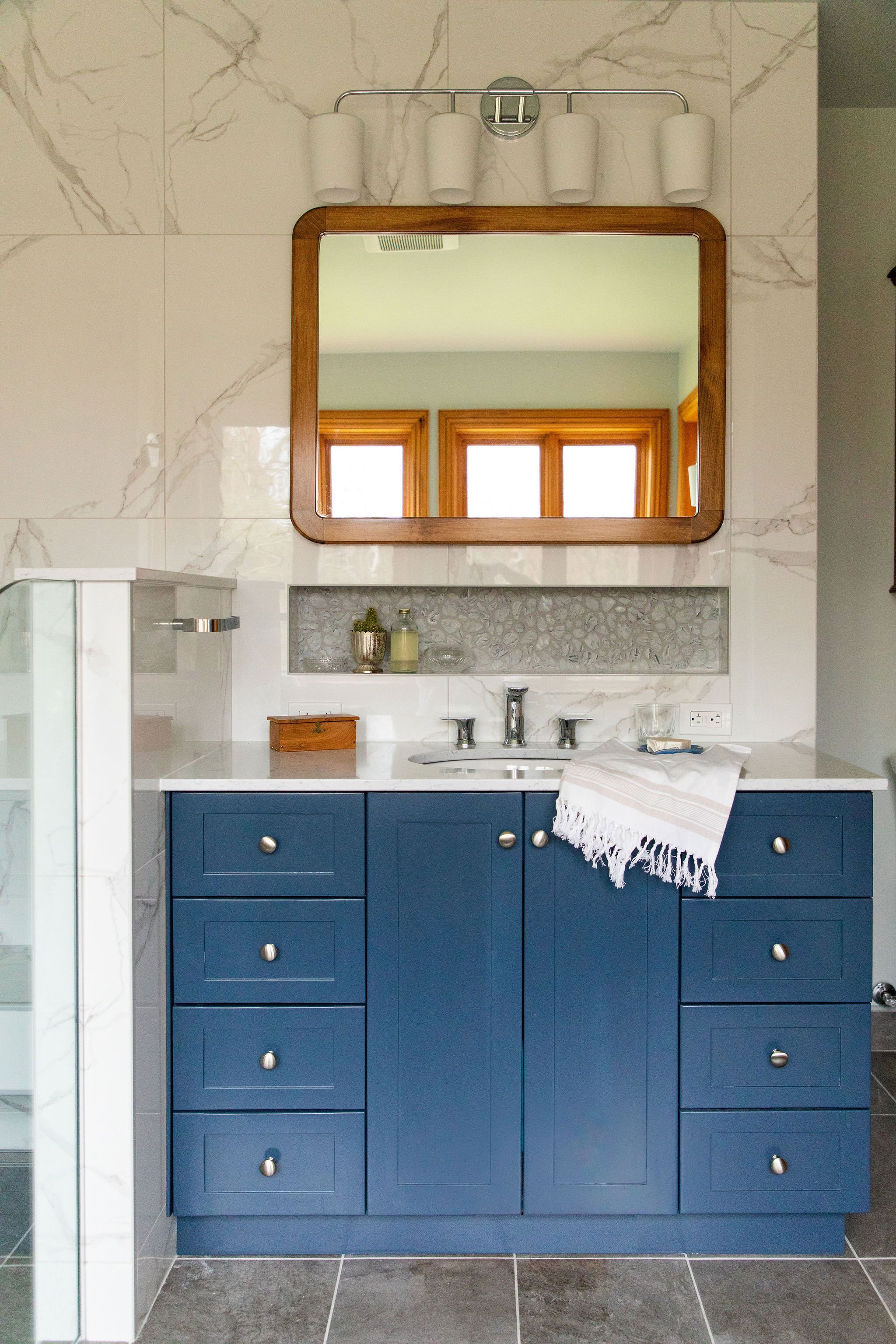
The new bathroom includes a semi freestanding tub, a custom vanity and convenient storage niche above, an open shower with a bench and niche.
It was hard to let go after having a large tub built-in with wall to wall steps but necessary in order to have a new large, open shower. As a compromise, the new freestanding tub was semi built-in along the back wall which allows for space to set a few things down.
Drapes were not needed and not wanted. The bathtub is surrounded by three sides of windows. Viewing out at nothing but forest makes this ensuite feel like such a retreat.
The shower combines a few design elements. The floating bench which is an anti-slip surface allows you to sit and easily access the handheld shower to your right and all of your essentials in the niche to your left.
The shower is a sloped floor with a linear drain tucked under the bench. A tiled half wall and small piece of curved clear glass keeps the water within the shower, allowing a bright and airy feeling with no obstructions throughout the entire bathroom.
A custom deep blue shaker style vanity was made by a local cabinet maker. The vanity which was designed to have many small drawers is perfect for storing small products. The countertop is a soft veined quartz stone.
I wanted to incorporate details to make the ensuite feel warm and inviting. The custom made mirror is solid wood and adds a touch of warmth that this new bathroom needed.
The long niche that divides the vanity and mirror above makes for a convenient spot for those everyday products.
The wood floating shelf was also made by the cabinet maker. Hooks were installed below, making this an efficient space to display and dry towels.
THE MATERIALS AND PERSONAL TOUCHES
All of the fixtures and hardware are chrome, a classic metal finish. For the wall sconces and vanity hardware we went with a traditional style which really adds a sense of elegance to the space.
Large marble looking tiles cover the shower walls and bench. To balance out the wall tile and give the eye a chance to rest, soft, natural grey tiles were installed on the floor with a mosaic pebble stone detail, uniting the floor and wall tile.
A soft blue/grey paint covers the remaining walls and ceiling which pairs well with the marble tiles and creates a calming atmosphere.
Find out more about my design services and how to get started with your bathroom renovation.


