Welcome to The Farmhouse Boutique!
The early 1900’s building was used for various purposes over the years with remnants of its past uses but with a strong vision and experienced professionals to complete the electrical work, carpentry and millwork, plumbing and painting the space took shape.
Preserving the building’s integrity and beautiful original detail while incorporating fresh, new accents for the perfect balance of past and present.
Let’s head inside…
step in
During the first walk-through with the boutique owner, we observed the beautiful details of the building. The space had a good feeling and potential to be something special.
With a goal to enhance what already existed and to create a warm and functional space, it was time to move into the designing phase.
Reviving a historic building means thoughtful design decisions that showcase and preserve the integrity of the space, while blending in new elements.
Blending old & new
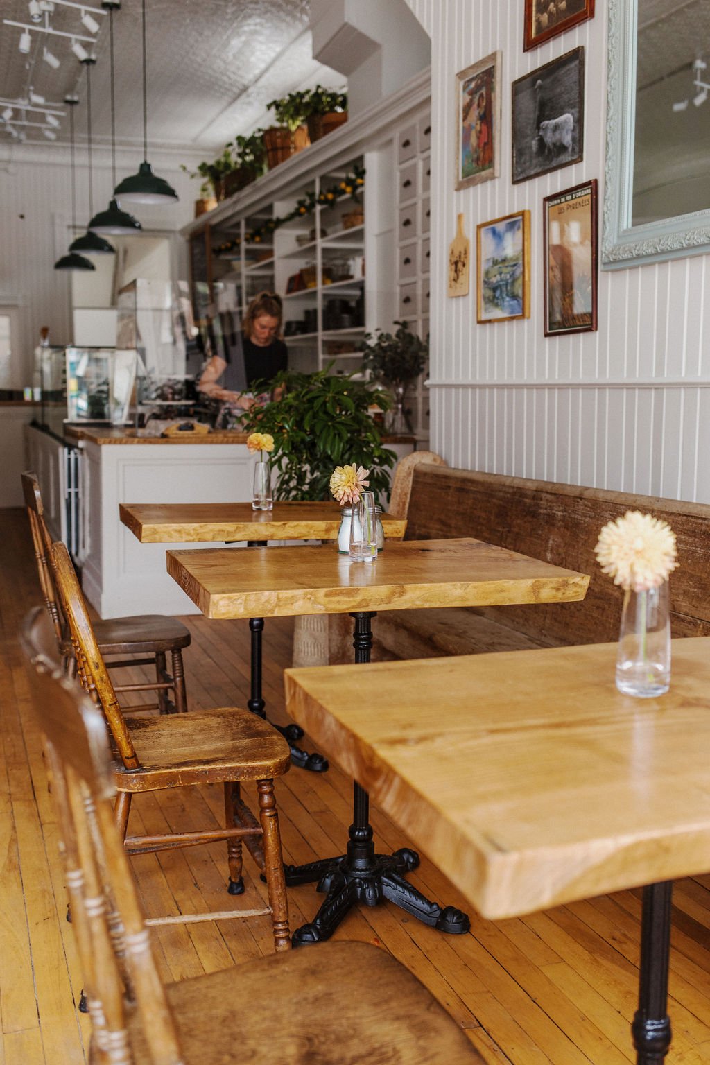
Old church pews along the side wall are paired with new, locally made tables for a perfect balance of old and new. This dining section is completed with a large gallery wall featuring charming sheep and landscape artwork.
Along the other side wall, a large custom made live edge table is positioned and paired with sleek modern Windsor chairs and oversized rattan pendants setting a warm atmosphere.
A lounge area was designed around the existing storefront window platform. It’s now a cozy resting point with natural light flooding in.
revamped & Ready
The built-in shelving wall now serves as a practical dishware storage and prep space.
A series of counters and displays sits in front, finished with custom shaker panels and a sealed barn wood countertop. Uniting original and new millwork in a way that feels seamless.
Teal vintage-inspired pendants hang above the length of the counters to set a soft glow and add a touch of color.
In the details
For a fresh look, the paneled walls were painted a two-tone soft white and light grey beige, harmonizing with the hardwood floors.
The detailed tin ceiling was repaired in a glossy finish to contrast with the walls. This draws your eye up to highlight the detailing.
Dimensions, planning, drawings, research, meetings, careful considerations for the color palette to work with the architecture and selected textures, materials, patterns, lighting and furniture all went into creating the space.
In collaboration with the boutique owners and all of the trade professionals involved, this building has been carefully and thoughtfully revamped and ready for its new chapter to unfold.
Share your thoughts. Leave a comment below!


